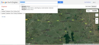
Google Earth Engine is a powerful tool in many aspects. We can, for example, look at the visualization aspects of the platform. The area of interest, in this case, is Bungoma region of Kenya, and we would like to visualize changes over time. For this example, we shall focus over the years between 2013 and 2021 in the following steps.
Search for the region of interest
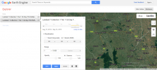
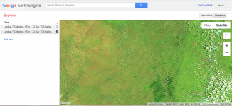
Add the data layer to the workspace and adjust the date to September 2013.
Add the same data layer as above to the workspace and adjust the date to September 2021.
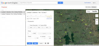
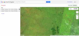
Visualize the changes. The bands used are 5,4 and 2, as vegetation is better visualized in false color.
Google Earth Engine has powerful tools for visualizing data results from various analytical processes. For more details about GEE, visit this Website
Find more information on Computing NDVI in GEE


Visualize changes over time in Google Earth Engine